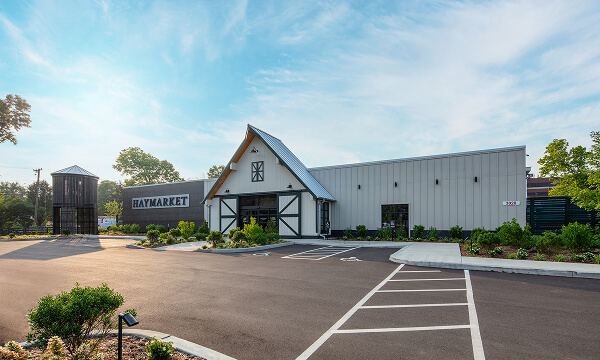
Haymarket River Road
Coffee | Breakfast & Lunch | Signature Salads & Sandwiches | Drive Through Café
3020 River Rd, Louisville, KY 40207
Coffee | Breakfast & Lunch | Signature Salads & Sandwiches | Drive Through Café
3020 River Rd, Louisville, KY 40207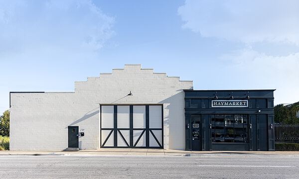
Coffee | Breakfast & Lunch | Signature Salads & Sandwiches | Gifting
723 East Main Street, Louisville, KY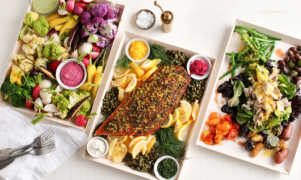
Louisville Farm-to-Table Catering | Chef-Prepared Menu | Office Lunch Delivery | Event Catering
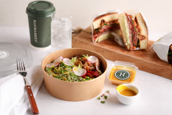
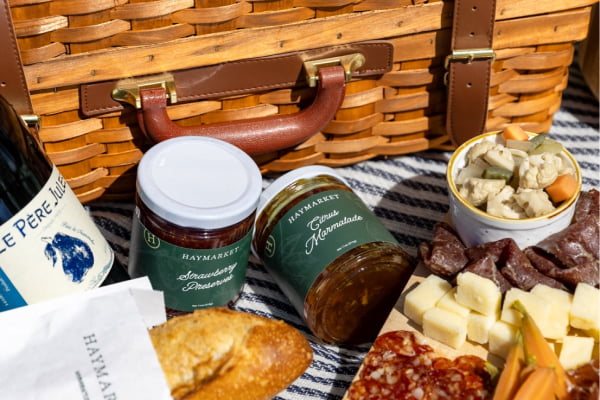
3020 River Rd, Louisville, KY 40207Simplicity, clarity, and nature — delivering on a minimal, uncluttered visual approach with an emphasis on on sustainability, connection and health. Overall, the visual identity is cohesive and approachable, allowing the quality and goodness of our farm store products to take center stage.

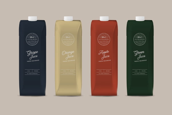
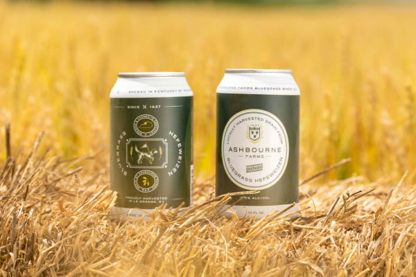
Our brand principles call for ample white space to create a sense of calm and balance. Our color palette is directly drawn from nature, featuring muted earth tones like greens, olives, and soft neutrals, which evoke a connection to the world around us, including Ashbourne Farms and our Haymarket garden. Typography is straightforward and elegant, with sans-serif and script types that convey culinary excellence, paired with serif types that are approachable and accessible. Imagery, when used, highlights fresh, wholesome ingredients in their most natural environments, fostering an authentic and transparent brand image. Packaging and branding elements are designed to be both functional and sustainable, reflecting a commitment to our environmental impact as everyday consumers.
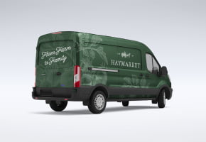
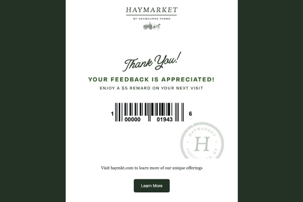
These colors are intended to be used to communicate the visual identity of Haymarket. They are intended for marketing materials (both print and digital) such as truck wraps, cups, social and email marketing, website design, etc.

Our brand palette draws inspiration from the timeless beauty of nature and the tranquility of garden landscapes. Our primary colors— green, tan, gold and white —reflect a harmonious blend of natural elements, each chosen to evoke a sense of calm, balance, and harmony with nature and what we eat to sustain.
Embody the vitality and renewal of lush foliage, symbolizing growth, freshness and a deep connection to nature. We use green to represent our commitment to sustainability and to evoke a sense of organic richness and vitality.
The warm, earthy tones of branches mirror the grounded stability of natural soil and sunlit pathways. This color anchors our palette with a sense of reliability and timeless elegance, providing a soothing balance.

HEX: 1F3324
RGB: 11, 92, 255
CMYK: 83, 63, 0, 0
Pantone 553

HEX: 818452
RGB: 11, 92, 255
CMYK: 83, 63, 0, 0
PMS 2727 C

HEX: CFB988
RGB: 11, 92, 255
CMYK: 83, 63, 0, 0
PMS 2727 C

HEX: FFFFFF
RGB: 11, 92, 255
CMYK: 83, 63, 0, 0
PMS 2727 C
These colors are intended to be used for the design of sub-label products, sub-brands, such as Ford’s Firs and Stella’s Lucky Eggs, and for special event purposes that are associated with Haymarket.

HEX: B54B26
RGB: 11, 92, 255
CMYK: 83, 63, 0, 0
PMS 2727 C

HEX: 7C1315
RGB: 11, 92, 255
CMYK: 83, 63, 0, 0
PMS 2727 C

HEX: 242E39
RGB: 11, 92, 255
CMYK: 83, 63, 0, 0
PMS 2727 C

HEX: BFCEC2
RGB: 11, 92, 255
CMYK: 83, 63, 0, 0
PMS 2727 C
Ensure that, when designing with our brand colors, the legibility & accessibility of color are of highest consideration. Only use combinations of white (or a lower opacity Tertiary Color) and the selected color. Do not merge these colors into an unorthodox combination where brand identity or accessibility standards must be upheld. Do not incorporate non-branded colors into the logo.
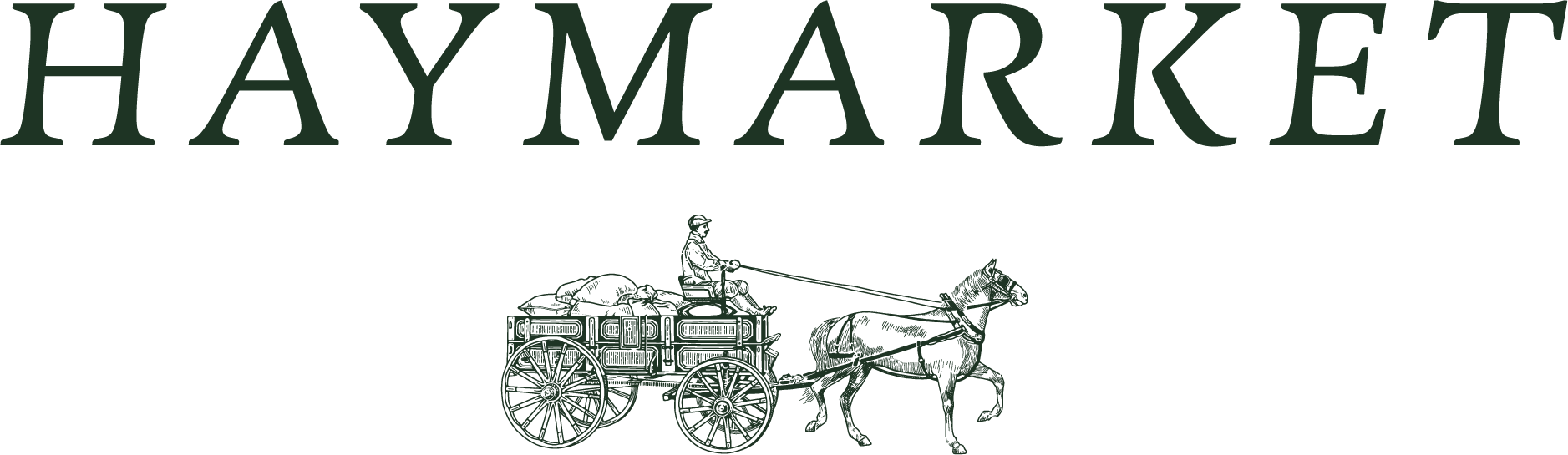
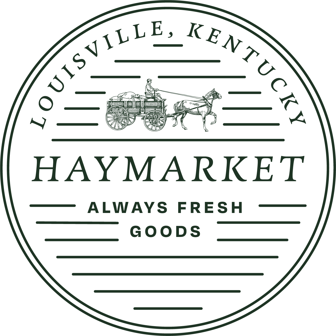
Our primary logos can be used interchangeably depending upon the environment and consumer experience. For example, when introducing Haymarket to consumers for the first time, we want a mix between the Wordmark and primary Horse & Buggy mark. However, once someone is in-store, they may see a jute bag with just the Haymarket ‘H’ Tweed or a trucker hat with the Haymarket Crest. Strategically deciding on a mark’s best use case in it’s environment will help generate interesting brand results and spontaneity.
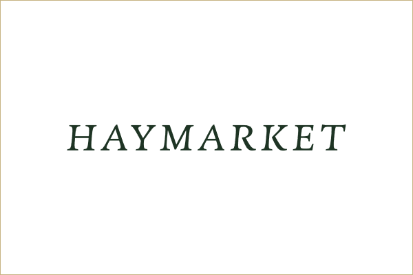
The following are considered interchangeable primary Wordmarks. They can be utilized in all brand instances where readability or viewability are not an issue.
In large brand building moments outside of the retail location, the Primary Workmarks should be utilized to introduce new consumers to the core of the brand.
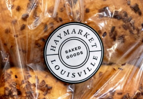
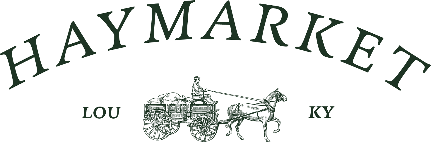
Our secondary logos can be used interchangeably depending upon the environment and consumer experience. For example, when introducing Haymarket to consumers for the first time, we want a mix between the Wordmark and primary Horse & Buggy mark. However, once someone is in-store, they may see a jute bag with just the Haymarket ‘H’ Tweed or a trucker hat with the Haymarket Badge. Strategically deciding on a mark’s best use case in it’s environment will help generate interesting brand results and spontaneity.
The Secondary Wordmarks can be utilized on in-store, packaging and marketing moments that are already within the context of the brand. For example, within an Instagram Story or on merchandise, as consumers are already within the context of a brand experience whether digitally or in-person.
Secondary logos are not meant to introduce consumers to the Haymarket brand for the first time, but rather, to offer moments of delight within the context of the well-versed Haymarket consumer’s experience.
Our alternative logos and marks can be used interchangeably depending upon the environment and consumer experience used as a design element or to identify the brand inside the context of a Haymarket consumer experience.

The Secondary Wordmarks can be utilized on in-store, packaging and marketing moments that are already within the context of the brand. For example, within an Instagram Story or on merchandise, as consumers are already within the context of a brand experience whether digitally or in-person.
Alternative logos are not meant to introduce consumers to the Haymarket brand for the first time, but rather, to offer moments of delight within the context of the well-versed Haymarket consumer’s experience.
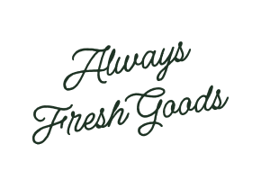
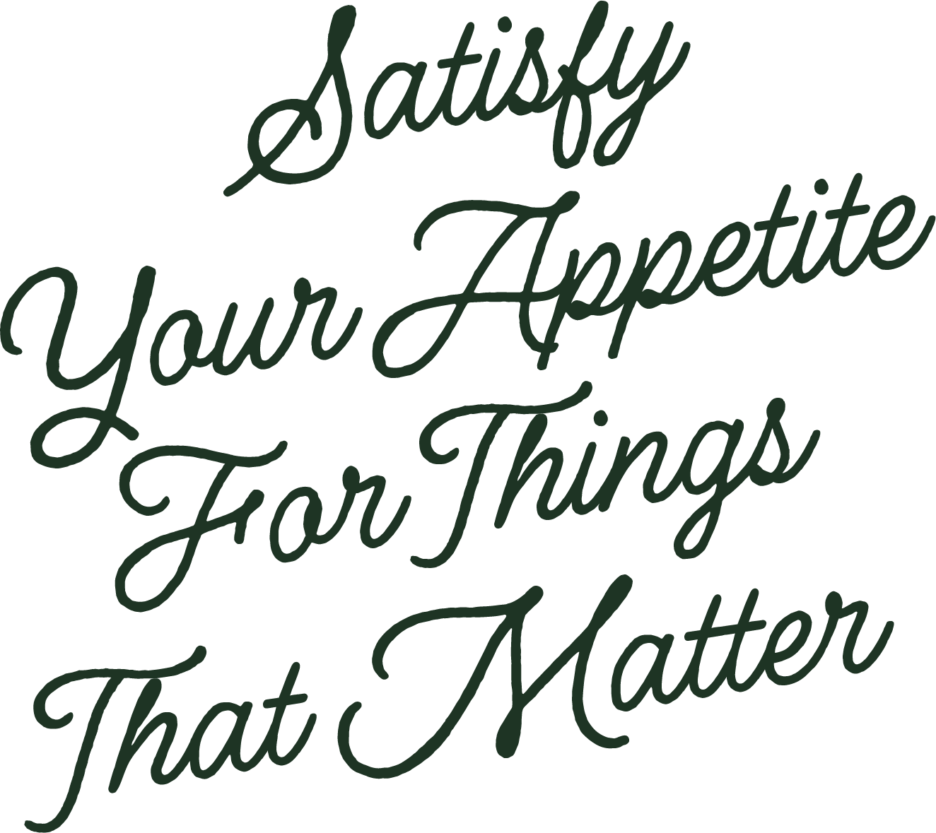
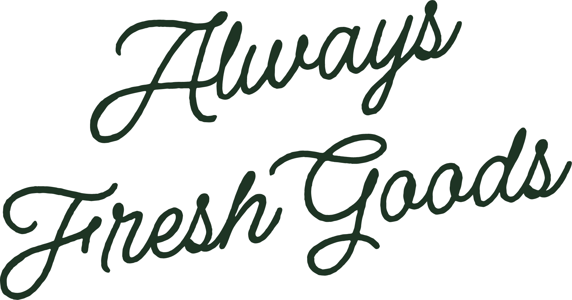
At Haymarket, our typographic choices are deeply rooted in the principles of nature and elegance, reflecting our commitment to timeless beauty and refined sophistication. We have carefully selected three typefaces — Espiritu, Degular, and Roboto — to create a harmonious and versatile typographic system that enhances our brand's identity.

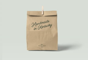
This elegant script typeface is inspired by the fluid forms of natural elements, offering a sense of grace and organic beauty. Espiritu’s flowing curves and refined lines capture the essence of nature’s elegance, making it our go-to choice for primary headings and high-impact statements. Its sophisticated style conveys our brand’s commitment to timeless sophistication and adds a touch of luxury to our Made in Kentucky feel. Use once per design instance for brand messaging, with 0 tracking and remember to hand kern the first letter when appropriate.

Our choice of Degular brings a modern and clean touch to our typography. Degular’s contemporary design enhances our visual communication with a fresh and approachable aesthetic, increasing accessibility.
Use mostly uppercase, in Bold & Semibold weights with 50-150 tracking.
This modern serif typeface embodies balance and functionality, with its clean lines and subtle geometric shapes, Cormorant provides a contemporary yet approachable look that enhances the readability of extensive text. Using mostly Regular weight, and occasionally Bold, Medium, Light & Italic with flexible tracking.
our typographic choices reflect a deep appreciation for nature’s elegance and the seamless flow of natural forms. For our long-form copy, we have selected Roboto as our primary long form typeface, a choice that underscores our commitment to clarity, readability, and refined sophistication.
When working with longform copy, we rely on Roboto, for all other design and communication needs, a mix of the three primary types, Espiritu, Cormorant and Degular should make up all short form designs, signage, labels and packaging to communicate the brand essence through our typography.
Our brand messaging is deeply rooted in the principles of farm-to-table authenticity and Kentucky pride. We are dedicated to celebrating and communicating the values of local, sustainable agriculture while honoring the rich heritage of our Kentucky roots. Our messaging emphasizes the direct connection between the farm and the table, highlighting our commitment to sourcing the freshest, highest-quality ingredients from local farms. We focus on transparency and sustainability, showcasing the journey of our products from the pasture to the plate. This approach not only supports local agriculture but also ensures that our customers experience the true flavors and nutritional benefits of farm-fresh produce.
Lorem ipsum dolor sit amet, consectetur adipiscing elit, sed do eiusmod tempor incididunt ut labore et dolore magna aliqua. Ut enim ad minim veniam, quis nostrud exercitation ullamco laboris nisi ut aliquip ex ea commodo consequat.
These messages can be used as primary brand drivers, or as design elements to add additional strength to the longform marketing copy supplied.
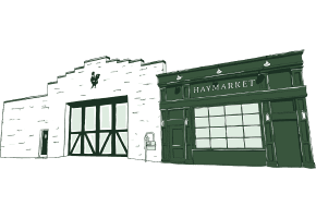
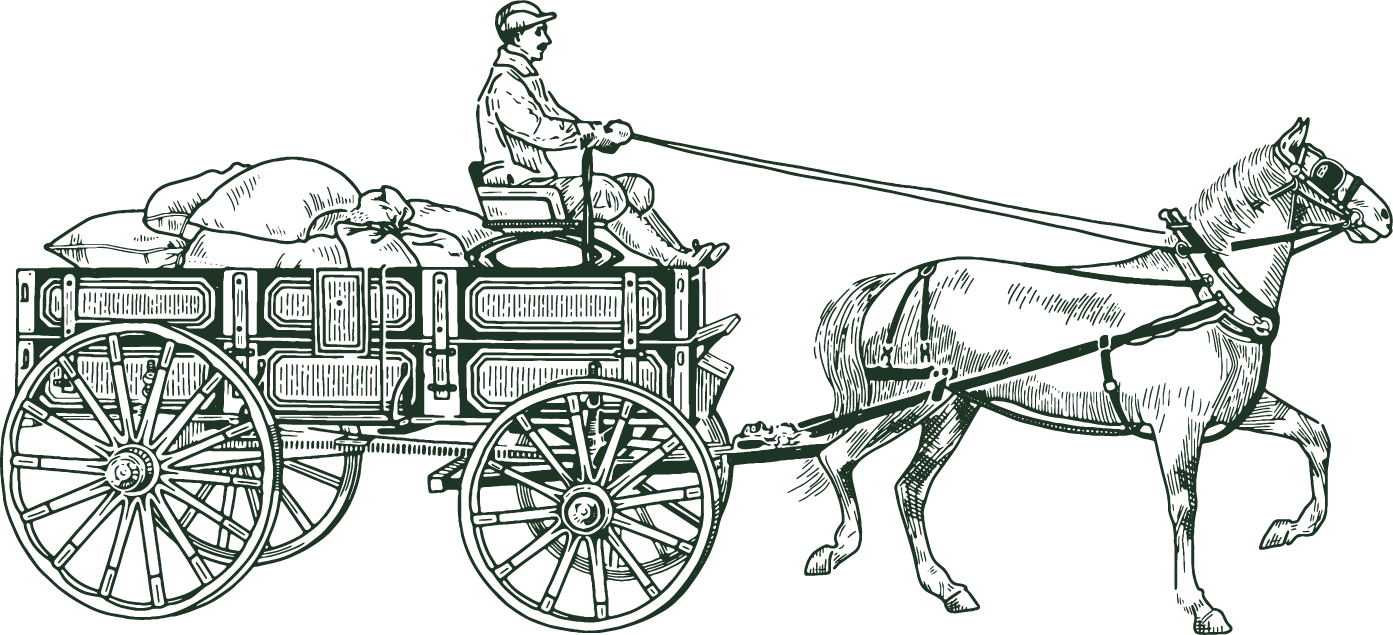
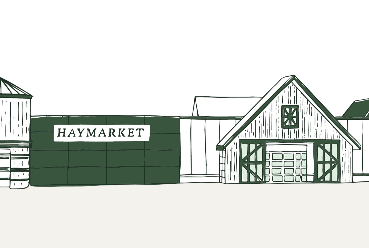
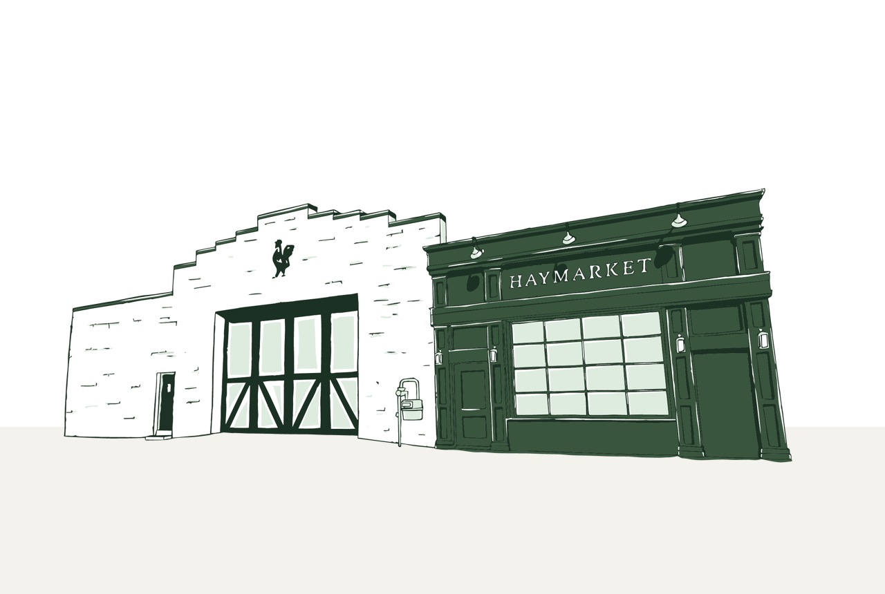
Our hand-drawn illustration style is a signature element that brings a distinctive and personal touch to our brand identity. Through our use of illustrations featuring currant tomatoes, coffee cups, and sketches of our architecturally inspired locations, we celebrate authenticity, craftsmanship, and the unique character of our offerings.
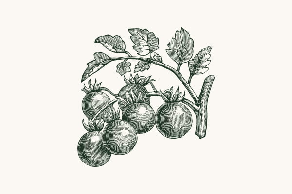
Our tomatoes and vine captures the vibrant freshness and natural beauty of locally sourced ingredients. Rendered with meticulous detail and a touch of whimsy, these hand-drawn images reflect our commitment to farm-to-table quality and the rich, authentic flavors we champion. Each illustration serves as a visual celebration of the freshness and vitality that define our brand.
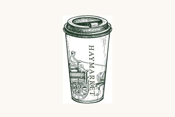
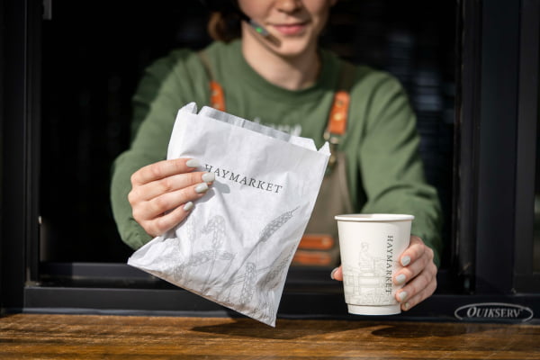
Symbolizing comfort, community, and the artisanal nature of our offerings, our coffee cup conveys a sense of warmth and familiarity, highlighting the care and craftsmanship behind every cup. By incorporating these images, we evoke the inviting and personal experience that defines our approach to quality and service.
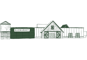
Our sketches of architecturally inspired locations capture the essence and character of the spaces that define our brand. Each hand-drawn rendering reflects the unique design elements and aesthetic details of our locations, bringing to life the atmosphere and inspiration behind our physical spaces.
Together, these hand-drawn illustrations create a cohesive and visually engaging representation of our brand’s values and character. Although an illustration isn’t always called for, the Currant Tomato & Vine illustration is consistently used as a watermark in the background of simple designs to add a layer of depth and storytelling to typography-driven design work.
our hand-drawn illustration style is a signature element that brings a distinctive and personal touch to our brand identity. Through our use of illustrations featuring currant tomatoes, coffee cups, and sketches of our architecturally inspired locations, we celebrate authenticity, craftsmanship, and the unique character of our offerings.
Together, these hand-drawn illustrations create a cohesive and visually engaging representation of our brand’s values and character. Although an illustration isn’t always called for, the Currant Tomato & Vine illustration is consistently used as a watermark in the background of simple designs to add a layer of depth and storytelling to typography-driven design work.


